Шрифт Сан-Франциско
Моряки
Astrolight Signature
Mostra Nuova
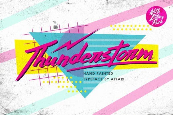
Гроза
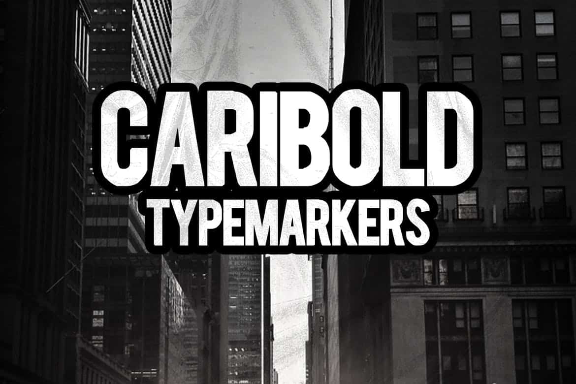
Caribold
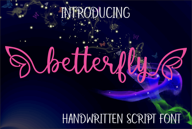
Betterfly
Rafaella
Шрифт Lavanderia
Лучшие бесплатные шрифты для скачивания: всеобъемлющее руководство
Добро пожаловать на ShriftKrasivo.ru, ваше лучшее место для поиска и скачивания высококачественных шрифтов. В нашей тщательно отобранной коллекции представлен широкий выбор шрифтов: от элегантных с засечками до современных без засечек, от выразительных декоративных шрифтов до практичных моноширинных вариантов.
Каждый шрифт в нашей коллекции был выбран за его исключительное качество дизайна, универсальность и практическое применение в цифровых и печатных проектах. Независимо от того, являетесь ли вы графическим дизайнером, веб-разработчиком или творческим профессионалом, вы найдете идеальный шрифт для своего следующего проекта.
Просмотрите наши категории, воспользуйтесь функцией поиска, чтобы найти определенные стили, или изучите наши последние добавления. Все шрифты доступны для бесплатного скачивания и содержат необходимую информацию о лицензировании как для личного, так и для коммерческого использования.